
I'll take a poke at the Power Girl costume because the original is one of the most discussed costumes in comics and, short of Vampira, the one most likely to raise questions and hackles.
 |
| example of redesign |
 |
| and original formula |
In comparison to Power Girl's traditional costume, he redesign certainly seems less aimed at appealing to the male gaze and creating a look that still honors the original. It appears functional and... well, I think this design is actually pretty bad, but we can talk about that later.
By the way, DC just spent a year with Peej (Power Girl. P.G. Peej. Don't ask) in a redesigned costume that was meant to keep her character intact but not have the immediate effect of the character be that PG exists simply as an object of lurid interest, as is often the initial reaction.
 |
| seen with her pal Huntress in "World's Finest" |
The costume you see directly above was considered a failure more or less from the arrival of the solicitation art. Huntress... she's looked like that before. She's got her colors right, the iconography is all in place, she's a rooftop, back-alley detective sort. It sort of all fits and isn't the ridiculous belly-shirt look given to her by Jim Lee (now publisher and chief designer for DC). But in the current title, World's Finest (the former Superman/ Batman team-up title), Power Girl looked like she'd been designed by committee, formed from pieces pulled from other characters and intended to look like something fresh - but, really, sort of like a failed costume concept from the mid-00's.
About a month ago, images started leaking out that the redesign was getting scrapped and we were coming back to the Power Girl look that we all knew from most of the character's existence (more or less. PG has been redesigned almost as often as Iron Man).
There's no question in my mind that the second image up there is intended to be sexy and provocative. So, let's not beat around the bush on that count.
What I would pause to consider is if covering Power Girl in multiple layers, as if she's walking around Boston in December, is accomplishing anything other than drawing attention to how many layers we've managed to put her in. We can chalk it up as a victory for folks who have a problem with Power Girl and they can feel that a cartoon drawing's modesty has been preserved.
I know that's a little harsh, but stick with me.
The design in the first image does accomplish the goal of covering the heroine, and that satisfies the desire to tell the fan-boy audience* that women can be strong individuals and not just objects to be gazed upon and a faculty member somewhere can call it mission accomplished. But Power Girl has a lot of female fans. We're getting into slippery slope territory dictating what is and is not okay for women to wear. I'd point out that Image #2, the one with PG astride a shooting star, was drawn by Amanda Conner, who redesigned Power Girl's costume for that era, and, it seems, she herself is no stranger to being a lady.
Yes, if you have the typical Adam Hughes cheesecake cover, you've got yourself a bit of grade-A cheesecake on your hands. Sort of. I think in the pre-New 52 relaunch, in particular, DC tried with Power Girl, knowing they had something complicated on their hands.
 |
| The alternative cover to Power Girl #1 by Adam Hughes |
To play devil's advocate, and, honestly, to reflect the tone of the comics I'm pretty sure only I read, the series was almost a sitcom in which PG was presented as an uber-capable, confident, and casually aware that she was attractive and wasn't ashamed of her femininity. This wasn't a comic laughing AT Power Girl, it was a comic that, as a lot of people have tried for years to do with Power Girl, gave her the upper hand embracing her appearance, intellect and, yes, sexuality on her own terms. She had actual power beyond invincibility and heat vision. But she still had a cat that was a jerk and dealt with annoyances large and small. In some ways, it was the same sort of debate that broiled up around Ally McBeal and her short skirts.
I know, I know... privileged class white male making excuses.
Nonetheless, there was and has been context to Power Girl from the character's inception in the 70's as this sort of character. Hilariously cantankerous, often eye rolling at the mad scientists and gorilla armies marching on a major metropolitan area... in a few ways, the character was accidentally, as I don't think it was often intentional, a bit on the forefront of gender issues in comics. In JSA Power Girl was portrayed as the uber-capable co-leader of an enormous team of people who were a sort of walking nuclear arsenal.
 |
| Ross's cover to JSA #9 |
But, yes, the "boob window" as it's come be known, is a distraction and complication. Lump in the lack of knowledge even most comics fans have about the character, and the winky image of Power Girl flexing becomes a Rorschach test that's as much about the viewer as it is about what's happening in the picture.

The nature of the character can be misinterpreted here and we're back to a focus on the boob window and cut of the legline rather than the wink at showing one's guns in a selfie. There's a two-dimensionality foisted on the character in part because - who the hell knows anything about Power Girl, but they do know what they're supposed to find alarming.
Before we go assuming that this costume is completely outrageous and impossible, it's all over the place for the CosPlay kids. It's been taken on as a challenge right next to the challenge of deciding one is going to go out in Wonder Woman's satin tights or Poison Ivy's... leaves, I guess.**

Not that CosPlay is, in itself, an indicator of anything but someone's ability to show up in a costume, but to assume that the costume and character are a put off to all right-thinking people of either gender is, of course, pretty complicated.
(For the love of God, though, be careful looking up any popular female superheroine on tumblr. There isn't enough bleach for you eyes for the "fan art", but we'll talk about that another day.)
If I'm allowed to get technical, superheroes on the page are a complicated matter. In many ways, complicated costumes are an exceedingly bad idea in superhero comics as characters are handed from artist to artist. What becomes important is the iconography of the character, or, more crassly, the branding. Think of the red cape, boots and shorts on Superman. Stuff people still lift, even as they obscure the "S" shield for copyright purposes.
Yes, it absolutely makes no sense that Wonder Woman is the only Justice Leaguer to go pantsless into superhero squabbles. I get it. You don't have to sell me on the logistics. And you won't find a bigger Wonder Woman fan among your straight male friends.
On two separate occasions in the past two years, DC tried valiantly to redesign the character in the comics, and the TV show starring the (I thought not-a-bad-choice) Adrianne Palicki also sported trousers in several scenes.
.jpg) |
| Jim Lee try 1 |
 |
| designed by Jim Lee, art here by Cliff Chiang |
 |
| Palicki or no, pants or no, this pilot was absolutely terrible |
Anyway, when Wonder Woman #1 hit...
 |
| those archers must have her pants |
The problem is that you basically run into a branding issue if you've spent the past 70-odd years planting your corporate IP in someone's mind. Even if you look at these images and say, "well, I guess that makes sense to put her in pants, but... now why is she wearing a bustier? What's with the golden eagle on her chest? What else can we remove and essentially change about the character's look?" We know the red and gold up top, the tiara and bracelets. The star spangled pants and action hero boots. Whether we know them or not, we know that there's bare leg there, and putting her in dark pants with dark boots suddenly makes her look like someone possibly going out clubbing.
In a lot of ways, successfully implementing the new design would have been a branding nightmare for DC and their licensing department. You've essentially got multiple versions of a single look to a single thing and because a person who hails from a magical island with an invisible plane, a lasso that compels people to tell the truth, and who can catch bullets in her teeth and lift a tank... you're reacting to the implausibility that this person isn't wearing pants?
Deep down, we all sort of have an idea of what that character looks like, and DC relies on its brands for some characters.
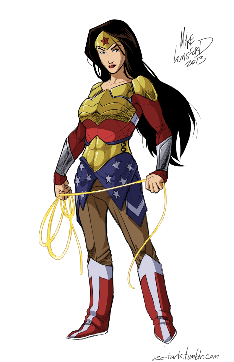
But, again, we sort of know what Wonder Woman looks like, as a culture. That's powerful, powerful stuff.
 |
| this is probably a little closer to what John or Jane Q. Public think of when it comes to Wonder Lady |
By the way, boob window or no, there's something iconic enough about the simplicity of the Power Girl white costume with red cape and blue gloves and boots that we keep winding up back at that look.
Draw all the seams and mandarin collars you want on Superman, but the licensing group is eventually going to point out that they still sell a ton of t-shirts with the guy in his circus strong-man suit because... seriously, you're trying to rebrand an icon that's up there with baseball, apple pie and the American flag?
Get with it, DC.
In a lot of ways, the "full dressed" artist gets it. Wonder Woman has iconography he's preserved. The tiara, the breastplate, the star spangled "skirt" below the girdle. But, man, why is she wearing pressed Dockers tucked into her boots? As near as I can tell, because khaki is roughly reading as "skin" rather than adding red, blue, black or yellow where we're used to seeing flesh tones.
It's just a guess.
And, while the characters in the costumes at the link that kicked off this article are covering the characters... are they any good?
I'm not sure they are. They're busy. There's a "real clothes" feel to the looks, but that's not necessarily a bonus for someone in a superhero comic. The Power Girl costume, in particular, just winds up a mess of street clothes, homages to her superhero roots and a sort of futuristic undershirt or collar thingy... And you can see her bi-ceps through a white coat? Tim Gunn would not approve.
Anyway, we're visual creatures. We tend to get weird about changes to the looks of things, even if we don't know why, or respond to things when they do look right.
And while adding layers is a way to go about covering the characters, it's also a complication for artists who didn't originate those outfits from streamlined ideas meant to allow any artist who can basically draw a person to come in and take on the art chores.
I can't stress enough - it's really easy to draw Wonder Woman in this outfit for one nice picture where you can get it all pretty. It's another thing to do it on 3-6 panels per page, 20 pages per comic, 12 issues per year. And that's if you keep the original artist and you're not talking about multiple books.
Comics is sort of a grind for artists, y'all. Some can pull off all the doo-dads on outfits, and the rest end up spending 18 months wrestling with a Jim Lee design on Superman that only Jim Lee has sort of made work, and even he only occasionally pulls it off.
I don't have a great answer of the issue, because it IS a problem for superhero comics (and therefore comics) in its public perception as a media for emotionally stunted dorks. Editors seem to struggle with understanding that shorts on Wonder Woman is one thing and showing butt-cleavage on Wonder Women is another - and I don't know why. It seems like a few simple guidelines can't be that hard to put in place.
And when you're coming up with new designs for characters, maybe think a little bit harder so you don't make me embarrassed to pull your comic off the rack.
 |
| I shouldn't have to hide appearances of Star Sapphire behind other comics |
Look, designing a successful superhero costume is really hard and seems to be something artists just sort of accidentally stumble into. What I hope is that we get more ideas like the Kate Kane Batwoman costume as we go forward with designs, and less of the New 52 Harley Quinn reboot.***
 |
| iconography |
If you're noticing I haven't had a lot of prescriptive ideas in this piece: well, I think if we knew how to solve this, it'd be solved. DC wouldn't be back-pedaling on their Peej redesign, Wonder Woman would be in slacks and we could call it a day.
All this said, it doesn't mean I don't find commentary on the costumes, posturing and portrayals of women exceedingly relevant and important (and more interesting than Trinity Wars or whathaveyou).
See:
The Hawkeye Initiative
The Brokeback Pose
also, no pants Justice League
 |
| this will never not make me laugh |
We can save poses for another day, because the Hawkeye Initiative covers that one really darn well.
For good or ill, the internet is full of character redesigns (usually with someone insisting "THIS HAS TO HAPPEN!!!"****). As someone who spends time every day looking at the comics internet and has for years... yes, there are many ways to redesign all of the characters. Some of them are driven by story-based practicality, some based on a love for Manga or furries, some driven by the institutionalized sexism of superhero comics.
I want the audience for comics to get better, and I want editorial to not make Carol Ferris wear a pink, crystal thong or put Supergirl in a mini-skirt and belly shirt. I sincerely want these things. And I want artists of all ages and experience level to not use Maxim as their reference when its time to redesign a character.
We saw some of that with the Batgirl reintroduction, the Black Canary redesign, Mara showing up looking like Mera... and those images need to be out there if we can keep the artists away from brokeback poses.
Anyway, it's a complicated ecosystem and I'm not going to figure it all out here tonight.
*I just type-o'd that as "fap-boy", believe it or not.
**and like all CosPlay, it can be met with varying degrees of success.
*** I can't even summon the energy.
****no, it does not
Ryan you can't stop blogging. I haven't been around as much lately but you are absolutely killing it lately with some of these very insightful posts.
ReplyDeleteThese costume changes must be a nightmare for the licensing division. People recognize the iconic Wonder Woman look and the new look while recognizable by us comic lovers would not be recognizable by non comic lovers. That would probably make it hard to sell t-shirts and other stuff which is probably where they make more money than the comics.
Some of the new costume designs look great in a poster but they must be an absolute pain for artists to draw no wonder books are late and getting even later.
That Hawkeye Initiative is just wrong, but it illustrates the the problem well. Comics have become politically progressive in so many ways, and yet they continue to dress their female heroes like strippers. We just had a gay wedding in comics, but Catwoman and Elektra still look like they walked right out of a 2 Live Crew video.
ReplyDeleteI don't see why this is so difficult. Are their really people out there reading comics for Wonder Woman's ass or Power Girls ta-tas? And if so, why is DC (or any other publisher) indulging them? You don't have to wrap them up in burka. Just de-sex them a little bit.
That first Power Girl redesign is pretty bad. It looks like a Disney Tomboy Princess. But the initial Wonder Woman design for the New 52, with the blue pants looks great to me. I don't think it takes a way from the classic Wonder Woman look. That khaki Wonder Woman is ridiculous. You don't have to go that far.
Men and women are different. We have different expectations of what they should look like. There's nothing wrong with that, but it doesn't mean we should tolerate artists drawing female heroes with the dimensions of their favorite porn star (Does Invisible Woman really have to be a 38DD?).
I have two small boys, and I wouldn't let them near comics today, in part because of stuff like this. My best friend who has two little girls who love superheroes, asked me where to get some Wonder Woman comics that were appropriate for them. I'm no expert, but I suggested he go back to George Perez's run or earlier. Why should that be necessary? Shouldn't girls get to read comics without the messages these images communicate? With superhero movies and cartoons so popular, why do DC & Marvel refuse to capitalize on the opportunity to get more women, more kids, and more minorities into comics? It just boggles my mind.
Good post.
It's beyond me, man. And because it does happen, good comics like the pre-New 52 Power Girl book when it was under Palmiotti, Gray and Conner - get dismissed as the bad-girl comics like Lady Death or, in an extreme case, Tarot.
ReplyDeleteIn some ways I like the current Wonder Woman, and in other ways, man... I'd love to see a Wonder Woman comic that I could hand to a middle-school or high school girl and say "this". Perez is a good option, and probably the Phil Jiminez run that I think was great partially because DC wasn't really paying attention and he did whatever he wanted for a while.
I'm a married guy. I don't like bringing home comics with images like the Star Sapphire image above. It doesn't help the story if Star Sapphire is in a pink thong. She could have been in a pink pantsuit for all it mattered to the book.
Power Girl and Wonder Woman can be in their traditional outfits if they're handled with care and respect. And sometimes DC is great about that, and sometimes... Ed Benes is given art chores.
Anyway, I guess I'm agreeing violently.
Yeah. I'm not hung up on Wonder Woman. She's had that look for 50+ years. Everyone's used to it and don't necessarily associate it with sex appeal. I just think the blue pants/tights are a good look and probably more practical from a superheroeing perspective.
ReplyDeleteAs for Power Girl's boob window - I dunno. I don't get it, but I've never read a comic with Power Girl in it.
I can confidently say, if they closed the boob window on the white one-piece for Power Girl, I'd be fine. I just like the gymnast look to the suit. I do recommend the Palmiotti and Conner Power Girl series. It's pretty short, maybe 12 issues, and it's a sort of superhero sitcom. Brings back 70's Superman supporting character Vartox really, really well.
ReplyDeleteAS per WW - I dunno about pants/ no pants. I also don't think it makes sense to go into a fistfight wearing a bat-cape and a mask with two convenient handles up top, but somehow we have to worry about WW going pantless? Anyway, again, I think with drawings and art like this, it all comes down to iconography, and you can move pretty well within certainly boundaries. I think what we learned from the Jim Lee pants looks is that once you make the legs blue, she just sort of looks like a lady going out on the town, and that's not very super.